
Introduction
The best paper for a printed catalog balances image reproduction, readability, opacity, handling, binding, and distribution weight. Choose the interior and cover together, compare physical samples, and confirm the final stock before production. A higher gsm does not automatically produce a better catalog.
An overseas catalog order brings together decisions that are often made by different teams. Marketing chooses the appearance, designers prepare the files, purchasing compares unit prices, and logistics manages delivery. Paper connects all four. Changing it late can alter color, spine thickness, finishing behavior, and shipment weight.
The practical starting point is the customer requirement: what must this catalog help someone do? A distributor searching technical tables needs different page behavior from a showroom visitor browsing full-page photography. A catalog handed out at an exhibition also has a different distribution profile from one mailed individually.
This guide explains how to build a useful specification, compare realistic material options, and approve the right evidence. Numerical examples are planning calculations, not JianMei stock commitments, test results, or quotations. Confirm the exact paper grade and production method for each project.
Define the catalog’s job before selecting paper
Image-led brand and product catalogs
When photography carries the selling message, begin with image reproduction and the intended surface appearance. Coated papers are common candidates because their surface treatment supports controlled ink behavior and detail. Compare gloss and lower-gloss grades with the same representative images.
Use photographs that are difficult to reproduce: pale products, dark textured surfaces, neutral grays, and saturated brand colors. A sample made only from bright, high-contrast images may conceal the weaknesses that matter in your actual product range.
Technical catalogs and dealer reference books
For technical content, readability can outweigh visual impact. Dense tables, small type, product codes, and diagrams need careful design and sufficient contrast. Evaluate glare under the lighting where the catalog will be used, and check whether reverse-side printing distracts from reading.
If customers write notes, mark product selections, or complete order pages, test the intended writing instrument. An uncoated paper may be worth considering, but the exact surface and any finishing still determine whether handwriting works well.
Exhibition handouts and mailed catalogs
A catalog that travels widely needs a distribution plan as well as a paper specification. Ask how many copies people will carry, whether the item enters a mailer, and whether weight thresholds affect postage. A slightly lighter interior may free budget for better photography, a useful cover, or protective packing.
Printing for Less also advises considering total weight when catalogs will be mailed. Treat that as a prompt to calculate your own finished-piece and packed weights, rather than assuming one paper grade is always the economical choice. Source: Printing for Less paper guide.
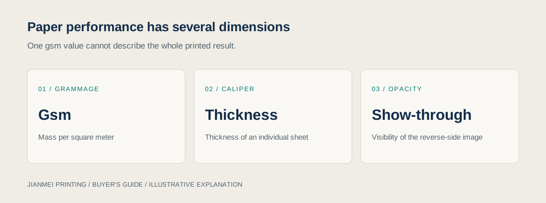
Understand gsm, caliper, opacity, and stiffness
Gsm measures mass per area
Gsm means grams per square meter. It allows straightforward mass comparisons when sheet area and quantity are known. It does not directly measure sheet thickness, stiffness, or perceived quality. Two papers labeled 150 gsm can behave differently because their construction and surface treatment differ.
As a planning exercise, buyers might compare 115–150 gsm interiors for a distribution-focused catalog, 150–170 gsm for a more substantial image-led version, and 250–300 gsm for a separate cover. These are illustrative discussion ranges, not universal recommendations or confirmed JianMei inventory.
Caliper affects the assembled product
Caliper is sheet thickness. It matters when calculating the book block, selecting binding, and preparing a spine. Ask for the chosen paper’s technical information or a measured dummy. A spine built around an assumed caliper can become incorrect after a stock substitution.
Stiffness also matters. A catalog should feel appropriate in the hand, but pages must still turn comfortably. Increasing interior weight throughout a long catalog can make the product less convenient even when the individual sheet feels impressive.
Opacity affects two-sided reading
Opacity describes how effectively the sheet limits visibility of material behind it. Show-through is especially noticeable when dark photography backs onto light areas or small text. It should be evaluated with representative two-sided printing rather than a blank paper swatch alone.
Keep show-through distinct from ink striking through the sheet. A page can reveal the reverse image because it is insufficiently opaque without ink having physically penetrated through. Describing the observed problem precisely helps the printer propose the right adjustment.
Choose gloss, silk, matte, or uncoated deliberately
| Paper direction | Useful starting application | What to verify |
|---|---|---|
| Gloss coated | Photography-led product presentation | Glare, reflections, and reading comfort |
| Silk or matte coated | Mixed imagery and detailed information | Actual sheen, image result, and surface marking |
| Uncoated | Writing areas or a tactile visual direction | Ink behavior, contrast, opacity, and pen performance |
Names such as silk, satin, dull, and matte are not perfectly consistent between suppliers. Request the grade name and physical swatch. Do not approve “matte paper” as if the phrase fully defines the product.
Paper coating and post-print coating are also different. A coated base stock may receive varnish, UV coating, or film lamination after printing. A matte-coated interior is not the same specification as a film-laminated cover. Identify each layer separately in the quotation.
If a warm or tactile appearance is central to the brand, judge it alongside color expectations. A paper’s shade and surface affect the printed result. Expecting an image approved on a bright coated sheet to look identical on a warm uncoated grade creates an avoidable approval problem.
Use a simple calculation to understand paper weight
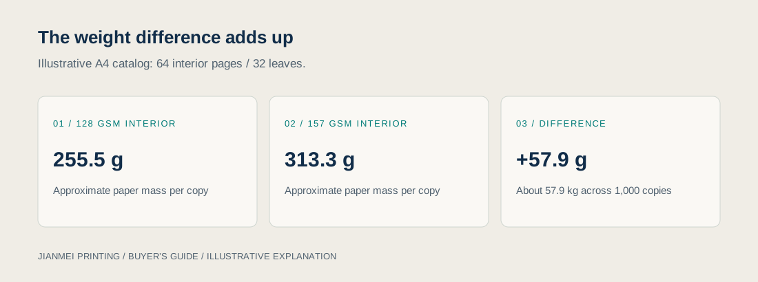
Consider an illustrative A4 catalog with 64 interior pages and a separate four-page cover. A4 measures 0.210 × 0.297 meters, giving a finished leaf area of 0.06237 square meters. Sixty-four interior pages represent 32 leaves.
Approximate interior paper mass = finished leaf area × leaf count × gsm. At 128 gsm, the interior weighs approximately 255.5 grams. At 157 gsm, it weighs approximately 313.3 grams. The difference is about 57.9 grams per copy, or approximately 57.9 kilograms across 1,000 copies.
This calculation uses finished leaf area and excludes covers, ink, adhesive, staples, film, packing, and production waste. It estimates the change in interior paper mass, not shipping charge or full shipment weight. Verify finished and packed samples before arranging freight or mailing.
The calculation is useful because it makes a tradeoff visible. A modest increase per sheet becomes significant over many pages and copies. Whether that extra mass is worthwhile depends on the reader experience and distribution method, not a general rule that heavier paper sells better.
Match paper to binding and cover construction
Saddle stitching
Saddle-stitched catalogs use folded sheets secured through the fold. Standard constructions use page totals in multiples of four, but the printer should confirm whether your stated total includes the cover and any special inserts.
As thickness increases, folded inner sheets extend differently from outer sheets, creating creep that must be managed during layout and trimming. Do not assume a page-count limit from another catalog applies to yours. Paper caliper, format, cover stock, and equipment determine feasibility.
Perfect binding
Perfect binding creates a glued spine and a separate cover wrapped around the block. Suitability depends on book-block thickness, paper, adhesive system, and the production line. Confirm the required inner margin because the opening behavior differs from a mechanically bound notebook.
Finalize the spine width after paper and page count are approved. Do not make a last-minute interior substitution while retaining the original cover artwork. Request updated dimensions and a new approval if the change affects the spine or hinge positions.
Mechanical binding for working reference books
Wire-O can be worth discussing when a catalog must stay open on a desk for frequent reference. It introduces a punched margin and exposed spine, so layout and packing need different treatment. Review the Wire-O buying guide before choosing it for a working manual.
For any binding, ask the printer to assess grain direction and folding behavior. A correctly developed paper and binding combination should be considered as a complete physical object, not a collection of unrelated line items.
Prepare print files for the selected material
Obtain the printer’s file instructions before export. Confirm trim size, bleed, safe margins, PDF requirements, color workflow, and treatment of special finishes. Adobe describes approximately 3 mm or 0.125 inch as common bleed practice while advising confirmation with the print provider. These are commonly used settings, not exact unit equivalents. Source: Adobe bleed guidance.
Bleed extends artwork beyond the trim; it does not protect critical text placed too close to the edge. Cover folds, glued hinges, and binding loss may require additional clearances. Use the approved template for the actual construction.
Check image resolution at final placed size rather than looking only at the source file’s metadata. Review small reversed type, fine lines, overprint settings, and black text construction with prepress. The right acceptance threshold depends on the process and artwork, so request guidance rather than applying one internet checklist blindly.
Identify spot colors, foil, embossing, and other special elements clearly. An on-screen metallic effect is not a foil specification. Separate artwork layers or files may be required, and minimum feature sizes should come from the production team.
Approve samples that answer specific questions
Paper swatch and blank dummy
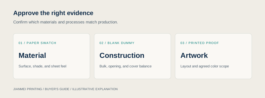
A swatch helps compare shade, surface, and individual sheet feel. A complete blank dummy helps assess bulk, handling, opening, and cover balance. Neither proves the final print color. Mark the grade and grammage on samples so similar-looking sheets do not become confused.
Printed proof and finishing sample
A printed proof helps review artwork and, depending on how it is produced, some aspects of color. Ask whether it uses the final paper and printing process. A digital proof on substitute stock cannot establish every characteristic of an offset production run.
For critical brand colors, agree the reference and evaluation conditions before approval. A phone photograph is useful for communication but unreliable as a color standard. Check any lamination or coating on the intended stock because finishing can change both appearance and handling.
Document the approved version
Retain the approved sample and identify the related file version, paper grade, cover treatment, binding, and accepted exceptions. If the factory proposes a substitute because the original stock is unavailable, review the effect on caliper, color, weight, and schedule before authorizing it.
Set practical quality and shipment checks
Factory testing should follow agreed requirements. Useful checks may include page sequence, trim dimensions, registration, visible marking, fold cracking, binding integrity, and handling after the specified drying or curing time. Where a test matters commercially, define its method and acceptance criteria.
For example, “no scuffing” is too vague without a handling condition and evaluation method. A high-coverage dark cover may show rubbing differently from a pale design. Evaluate an actual finished sample under conditions relevant to packing and customer use.
Shipment inspection should also address count per carton, orientation, protection, labels, and packed weight. Avoid overfilling cartons merely to reduce carton count. A heavy catalog shipment requires handling arrangements that fit the receiving location as well as the shipping route.
Align the production schedule with proof approval, material readiness, printing, finishing, packing, and transport. A required exhibition date is an arrival requirement, not a factory dispatch date. Build the schedule backward from the event and obtain a project-specific commitment.
Compare quotations using one specification
Send each supplier the same finished size, page count, quantity, artwork assumptions, interior grade, cover construction, binding, finishing, and destination. Ask them to identify exclusions and substitutions. A lower price for thinner paper or fewer printed pages is a different offer.
Request optional versions only when they answer a useful decision. Comparing a lighter interior with the preferred interior can reveal a meaningful cost and weight tradeoff. Asking for many barely different versions can delay evaluation without improving the buying decision.
Plan for repeat editions and material changes
Catalogs are often revised rather than purchased only once. Keep the approved paper identity, artwork version, proof reference, and finished sample together so the next edition begins with a usable specification. A new supplier or substitute grade should trigger a review of color, caliper, opacity, and binding rather than an automatic approval based on gsm alone.
If editions must look consistent when displayed together, say so in the brief. Compare a fresh proof with the retained reference under agreed viewing conditions. Also distinguish a deliberate design update from an unwanted production difference; otherwise purchasing may reject an intended change or accept an unintended one.
FAQ
What gsm is best for a product catalog?
There is no universal best gsm. Start with the catalog’s page count, imagery, opacity requirement, binding, and distribution plan. Compare physical paper candidates and a complete dummy before selecting the final grade.
Is matte or gloss better for catalog printing?
Gloss can suit image-led presentation, while lower-gloss surfaces may improve reading comfort in some lighting. The result depends on the actual grade and artwork. Review representative printed pages rather than deciding from the finish name.
Should the cover use the same paper as the inside?
A self-cover can suit some lightweight formats. A separate cover offers another balance of stiffness and protection. Confirm that the proposed combination folds and binds properly, and that quotation page counts distinguish cover and interior.
Does heavier paper prevent show-through?
Not automatically. Opacity depends on more than grammage. Compare two-sided printed samples with dark and light content, and request the paper’s technical information where available.
Can paper changes affect shipping costs?
Yes, paper changes affect finished mass and sometimes packed volume. The charge depends on the carrier, route, service, and packed dimensions. Calculate indicative mass, then obtain shipping quotations from final packing information.
Can I approve color from a screen?
A screen is useful for layout review but does not reproduce a printed paper surface. Agree an appropriate proof and physical reference for color-critical work, including what the proof can and cannot demonstrate.
Conclusion
Choose catalog paper by balancing the reader’s needs with production and distribution. Gsm is a useful specification, but caliper, opacity, surface, binding, and finishing determine how the finished catalog works.
A clear brief, representative samples, and a controlled approval record help buyers avoid changes that create new problems elsewhere. The goal is a catalog that presents products accurately, reads comfortably, and reaches customers in the intended condition.